Responsive Website Design
Is your website more of a dinosaur than it is digital? If so this is your article. Dinosaur meet Responsive Website Design or (RWD) for short. While responsive website design was a trendy topic back in 2013 I’d like to revisit the subject again as I believe it’s still a very relevant topic and one that more website owners and website managers should be better versed in.
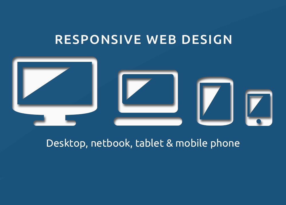
Responsive website design or (RWD) is a website design approach that is geared towards designing and coding websites to provide the optimal viewing experience across a wide range of devices. From mobile phones to desktop computer monitors RWD places top priority on navigation and easy reading with the least amount of re-sizing, scrolling, and panning.
Is your website a convoluted mess of versions for different devices or even worse, a single version that renders horribly on different devices like smartphones and tablets?
A responsive website adapts the layout to the viewing environment by using fluid, proportion-based grids, flexible images, and CSS3 media queries. A few years ago we “officially” moved beyond the necessity of having a separate mobile website. Responsive Website Design made that possible. We are getting ready to move into 2015. The real question I want to ask here is this. Is your website a convoluted mess of versions for different devices or even worse, a single version that renders horribly on different devices like smartphones and tablets?
Mobile local search is expected to exceed desktop search for local information in the next three years.
The case for re-designing your outdated website into a new responsive website design has never been stronger. As predicted 2014 has been the year that Mobile Devices outpaced PC access to the internet. As early as January 2014 the tide turned. More Americans were using smart-phones and tablets than PC’s when browsing the internet.
Mobile devices alone accounted for 55% of Internet usage in the United States in January 2014. If those facts aren’t enough to make a case for responsive website design there’s more. As consumers are now using smartphones as their preferred way to look up information while on the go, mobile local search is expected to exceed desktop search for local information in the next three years.
In Summary:
- Mobile device web surfing is growing at an astronomical pace
- Most websites aren’t optimized for mobile devices via Responsive Website Design or (RWD)
- Mobile Devices are constrained by display size and therefore require a (RWD) approach in how content is presented on screen
- There’s a ton of different screen sizes across phones, tablets, desktops, game consoles, and even TVs
- Device screen sizes will always be changing
- It’s critical that your website can adapt to any screen size, today or well into the future
- Responsive Website Design (RWD) is a no-brainer if you don’t want your brand being perceived as a dinosaur
Mark D. Hulett is the Senior eCommerce Website Developer & Designer at Georgia Web Development. His experience and working knowledge of eCommerce, website development and website design spans more than a decade.Mark responds personally to all inquiries and is more than happy to setup a quick phone call to discuss your project and answer questions.


